Alchemy

An overview...

Having worked on countless branding projects for clients over recent years, we kicked off our own re-brand recently – a fantastic opportunity to sit client-side for a change and road-test our processes!

With a visual brand identity around 10 years old, it was clear that while our internal culture – and external output – at Alchemy is creative and collaborative, our branding was not doing a great job to reflect this.

The answer? Time for a re-brand.

IMG_6839 copy
Screenshot 2023-06-29 at 11.11.45 copy
This has been such a team effort, with everyone in the team bringing something excellent to the project. Seeing our branding transform has been exciting, and we can’t wait to see where the next 15 years of Alchemy take us.
Paul Millard
Director, Alchemy

What did we do...

Five years ago, we spent time on our brand identity – checking in on our vision and values, what we wanted to communicate to clients and how we wanted to cultivate our internal culture. None of this has changed over the years, but we knew that our external branding did not reflect this in the same way.

It’s worth noting at this stage that any re-brand process is a significant project (if you are embarking on this too, we understand that it is A. Big. Deal – we’ve been there!)

Not only does it require a great deal of organisation and effort, but it also demands a process. And we love implementing a process!


Step one is always to do the research. For every re-brand project, we create a survey asking a range of anonymous qual and quant questions so that we can base the brand development work on research and data. This is crucially important to consider for both internal and external stakeholders, and the results are always incredibly valuable.

A big thanks to all of our clients, and to friends of Alchemy, who took part in this process. The good news is that the feedback reflected the brand values that sit at the heart of everything we do (phew 😅) and the comments around the brand, our services and touchpoints allowed us to tighten up our messaging, tone and positioning.

The results...

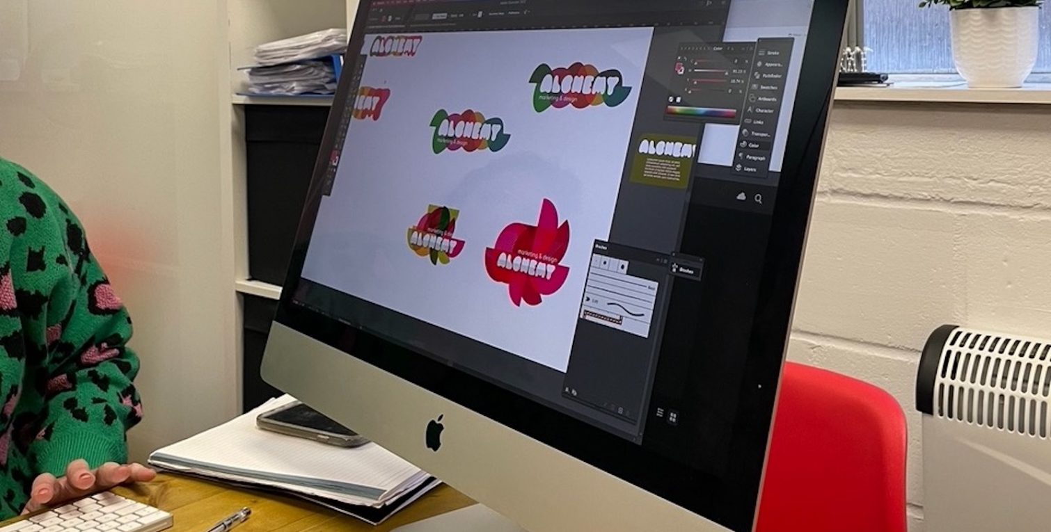
With our brilliant lead designer Sarah taking the creative reigns on concepts, our corporate visual identity has morphed into something much more fun. It’s a makeover that has really energised our business – and the impact of this is significant.

Moving from a simple red and black identity to a more energetic and colourful colour palette brings texture and vibrancy to our branding, allowing us to represent all the facets of our offer, and make the client experience more engaging.

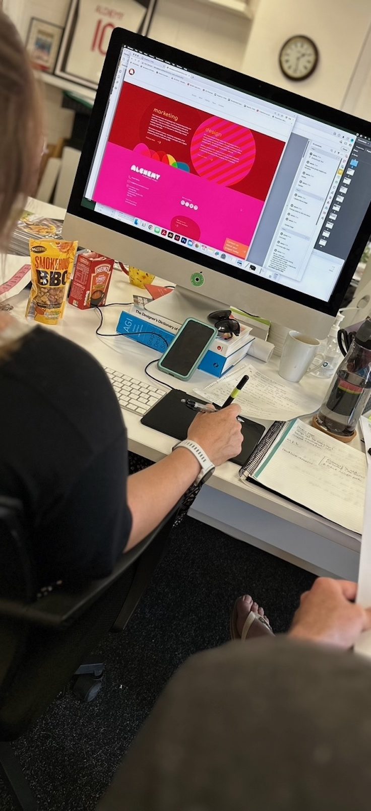
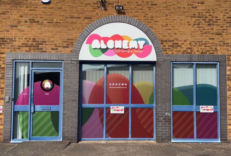
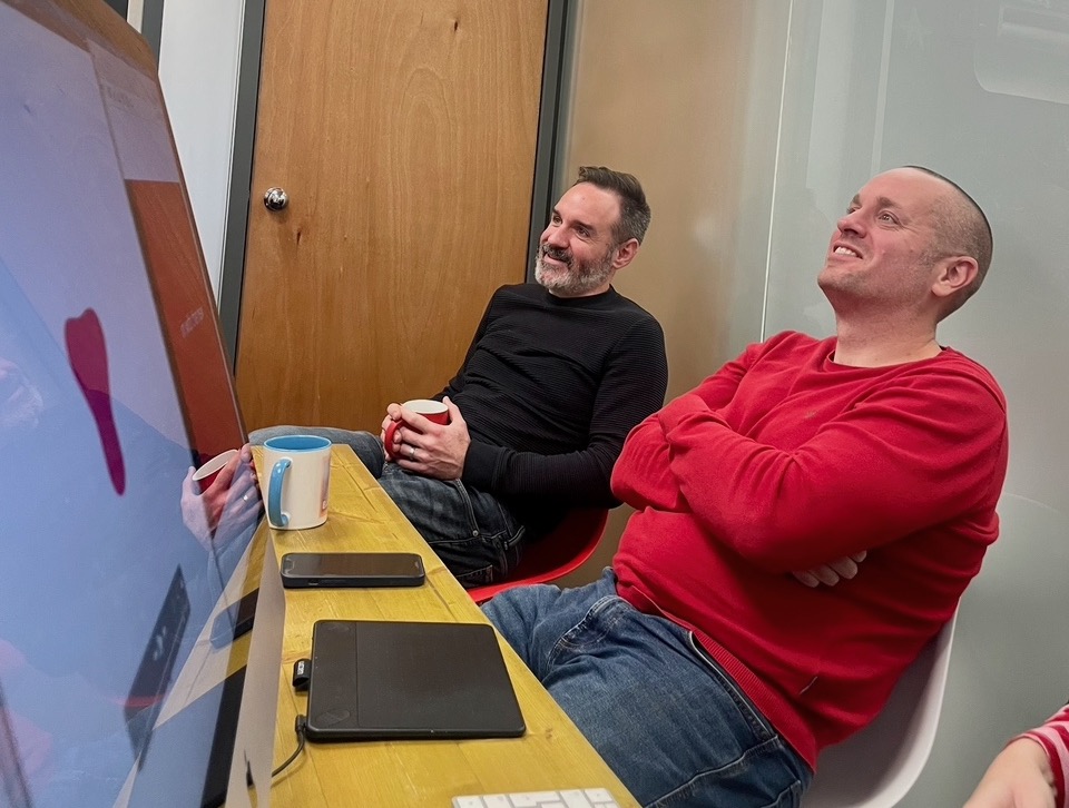
From our website to social content and email marketing, office interiors to little touches for clients – we have worked collaboratively internally to land our new visual identity. While it’s not always as easy (or appropriate) in larger businesses, all members of our ten-strong team have had the opportunity to feed into and lead areas of the creative process. And what a journey it’s been!

While a re-brand is an investment, it’s extremely worthwhile to enhance relevance and strengthen relationships, both internally and externally.

As a team, we get excited about coming to work, and our aim is to convey this to anyone who comes into contact with our brand. And we think this time, we’ve nailed it.

Post-launch results, incoming!

Next Projects

View all here